B2B subscription-commerce platform · Information architecture, three-layer permission model, design system
Published August 21st, 2026 · 8 min read
A B2B subscription-commerce platform had grown past a thousand configuration settings, each filed under the code that owned it. Finding one meant knowing the internals, so onboarding a new merchant ran through the support team. The engineer who built it admitted no one could find anything in it without him.
I came in to rebuild the structure, not to restyle it. I re-mapped every setting around the job a merchant is actually doing, and made visibility a computed rule instead of a per-customer fork. Then I pulled the whole surface down to the smallest set of repeatable templates I could, so the team could build the next section from a pattern instead of from me.
Onboarding stopped depending on the support team: merchants could set up and change their own configuration. New sections shipped without design in the loop, so delivery no longer waited on me. The taxonomy became the foundation the product still builds on.
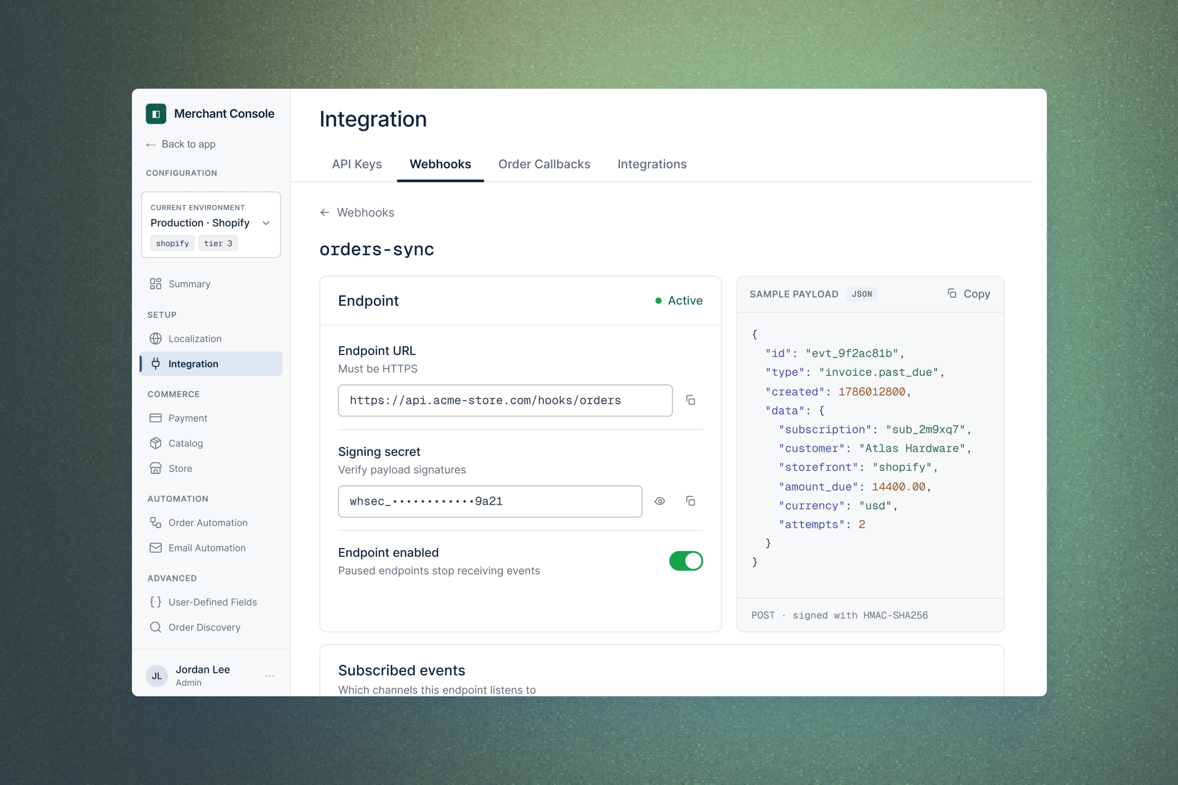
The screens in this case were rebuilt to protect the client's confidentiality. They accurately reflect the project I led and describe here.
I was brought in to redesign the product's configuration surface, part of moving merchants off an older app onto a newer one. On paper it read as a modernization: the same settings, a cleaner and more current interface.
I started by mapping what was actually there. That first pass is where I found the real project. The engineer who had built the configuration walked me through it and said this about his own product:
“There'd be no way to find it without me telling you.”
That line named the job. What the brief called a restyle was really the structure underneath the settings, and that is what I rebuilt.
Mandate: sole Product Design Partner, brought in to redecorate the configuration surface. I ended up re-architecting it.
The move I made: I took the work up a level, from hands-on decoration to rethinking the whole system. The product lead had the instinct to group settings by the merchant's job; I turned that direction into an actual architecture: the two-zone split, the visibility model, and the smallest set of templates the product could run on. That shift, from decorator to architect, is what the product lead saw and backed.
Decisions I owned: the three-layer visibility model, the call to explain gated sections instead of hiding them silently, and the screen-pattern system, held to as few variations as possible, that engineers build the rest from.
Partners: the product lead, who owned the domain, brought the job-grouping instinct, and validated the navigation with me; the engineering team, who would build the remaining sections from the patterns.
Out of scope: the backend flag system, the many settings that still lived only in the database, and a global search I proposed and we cut for scope.
The product came in two halves, and in the old app they were tangled together. Separating them was the first call.
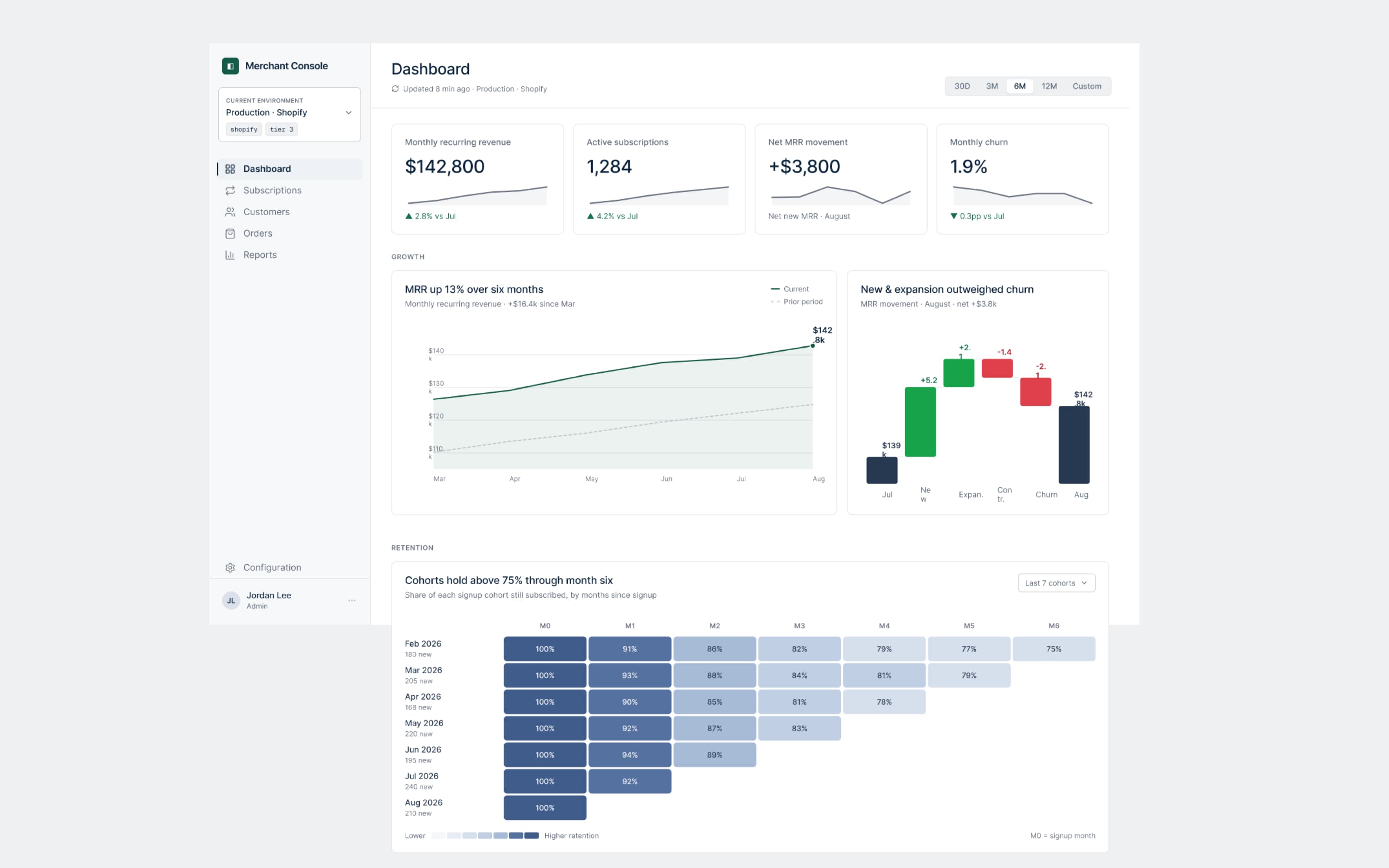
One half is operational: the surface a merchant works in every day, their subscriptions, customers, orders, and numbers. The other is configuration: the settings that decide how the product behaves. I split them cleanly, and that split later showed up in the interface itself as two separate sidebars, one for operating the business and one for configuring the product.
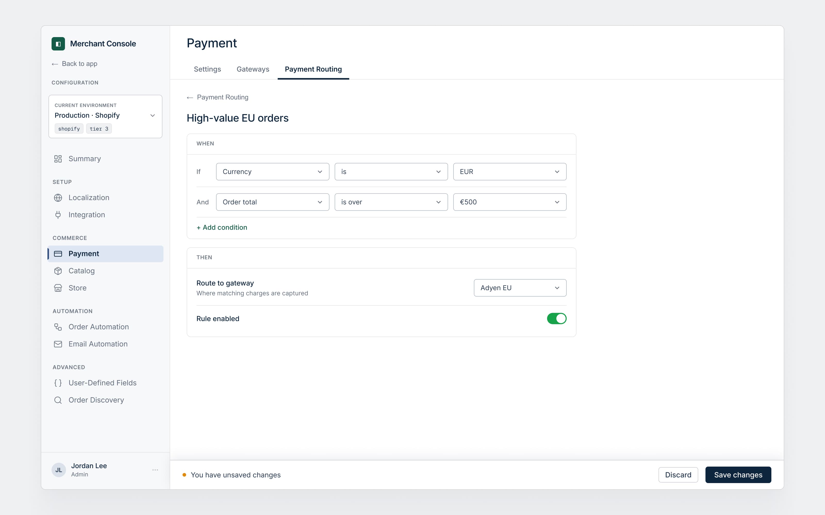
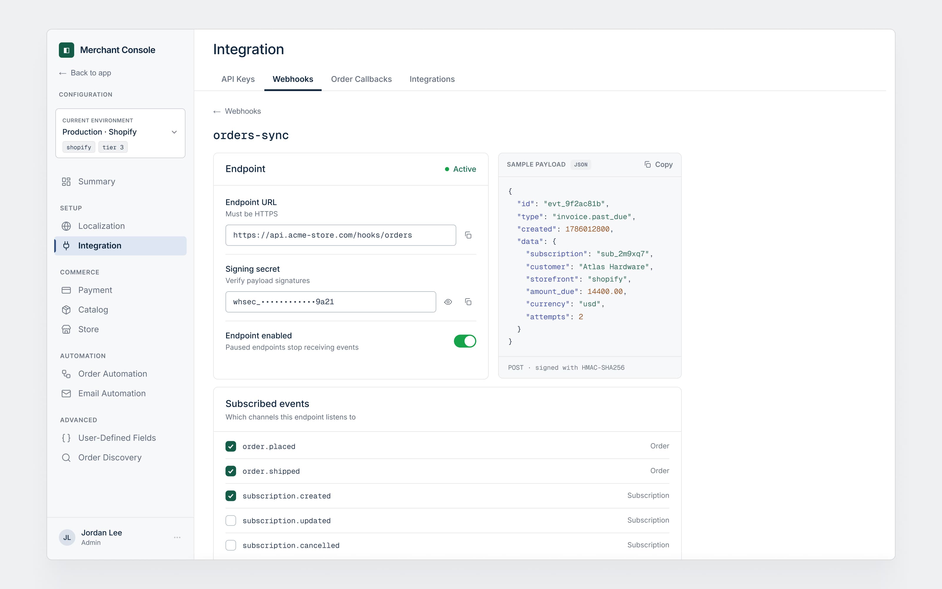
Configuration matters, but it is used far less often, and not every user has the rights to touch it. So it became a deliberate admin zone: entered from the app, left through a "Back to app" door, visible only to users granted admin access, and scoped by the environment they are in. Operational users never wade through settings they cannot change.
That split is the architecture the rest of the work hangs on.
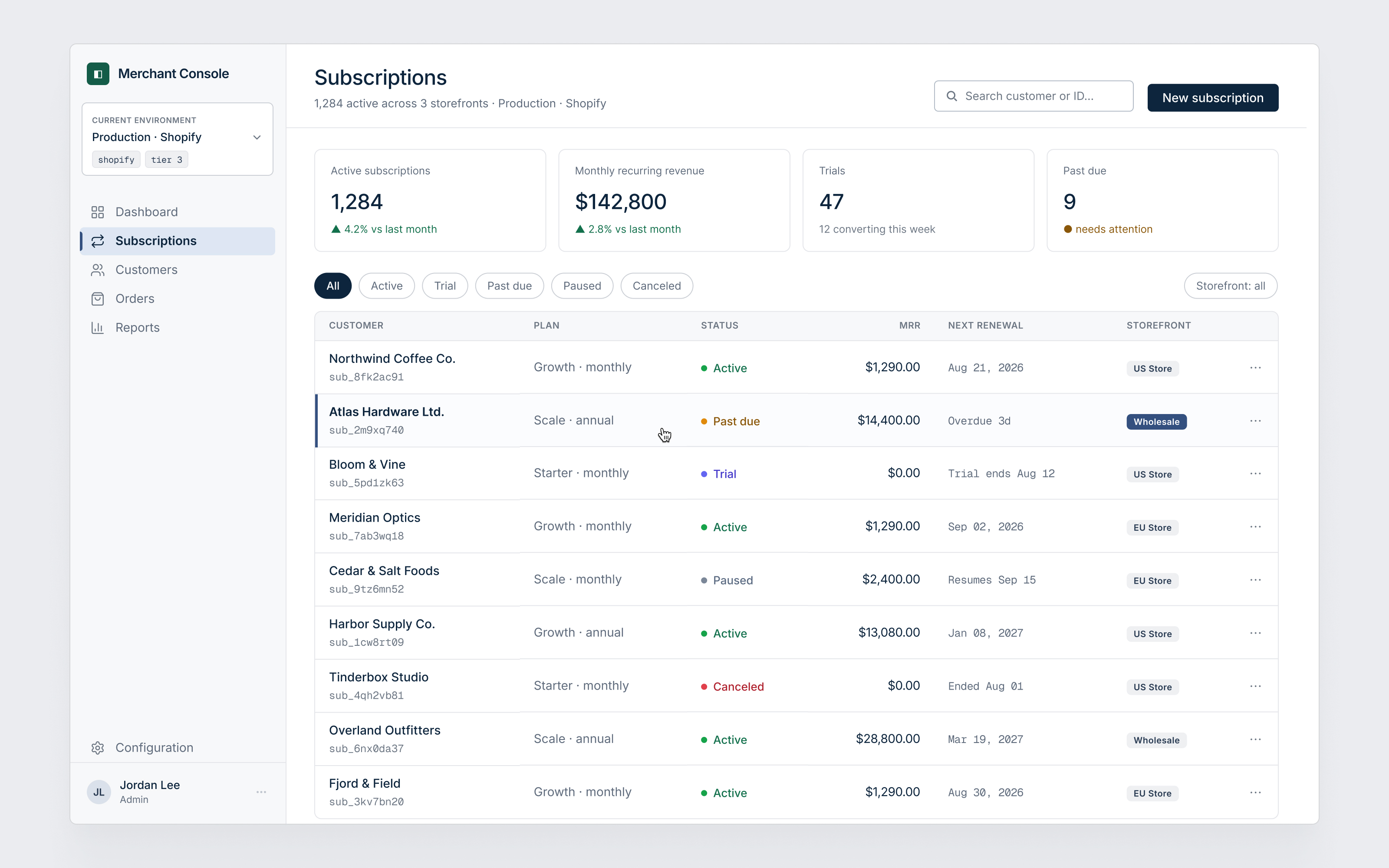
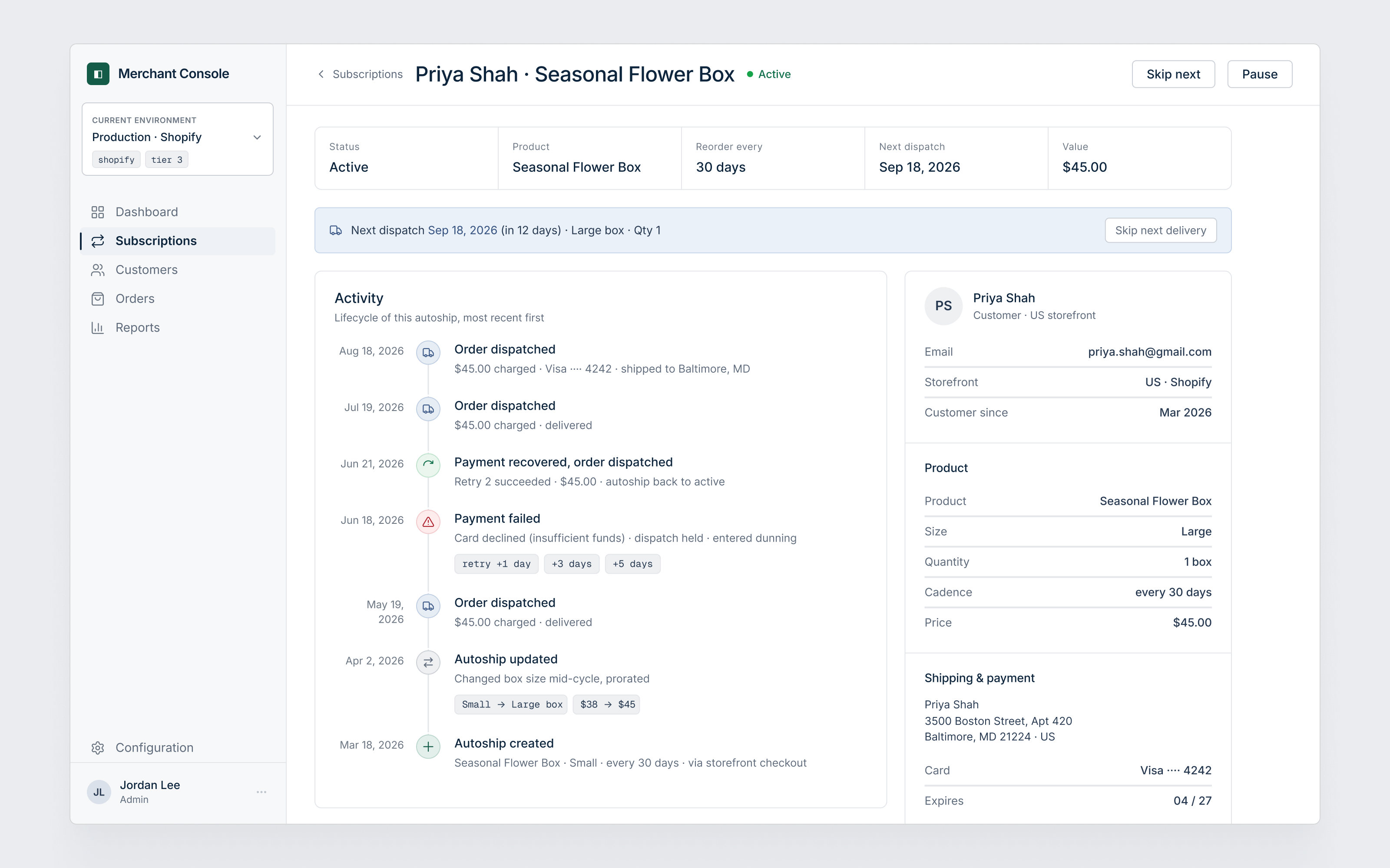
The operational surface had to stay legible while the data under it was layered and multi-store. A merchant might run several storefronts on one platform, and every subscription belongs to their customer, not to their account with us. The old app blurred both, mixing platforms in a single list and reading a customer's plan as if it were the merchant's own.
I modeled it straight: one environment is one platform, storefronts are facets of it, and a subscription is always a customer's recurring order for a merchant's product. On that model the operational screens could finally read as one thing. A dashboard tells the revenue story at a glance: where revenue is moving, and how retention and mix sit under it. A subscription shows its whole lifecycle, from checkout through a failed charge and recovery to the next dispatch.
This is where the engagement really sat. The configuration surface had grown past a thousand settings, and two problems hid under the redesign.
The findability problem. Every setting was filed under the module that happened to own it, not the job a merchant was trying to do. Finding one meant knowing how the software was built, so onboarding rode on the support team walking each merchant through it. My own first pass was no better than a new merchant's: I was lost, and I couldn't find things, and I build these for a living.
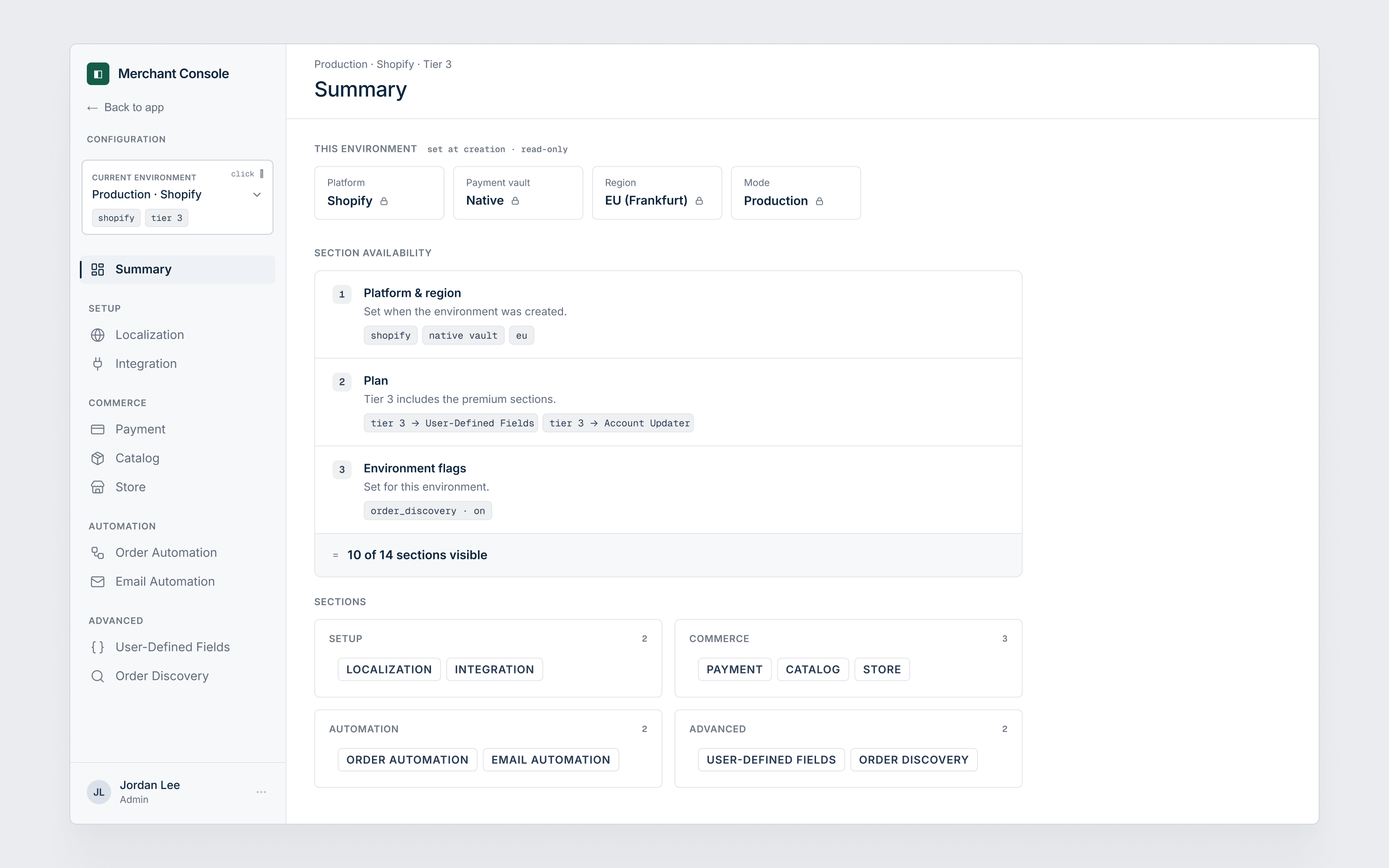
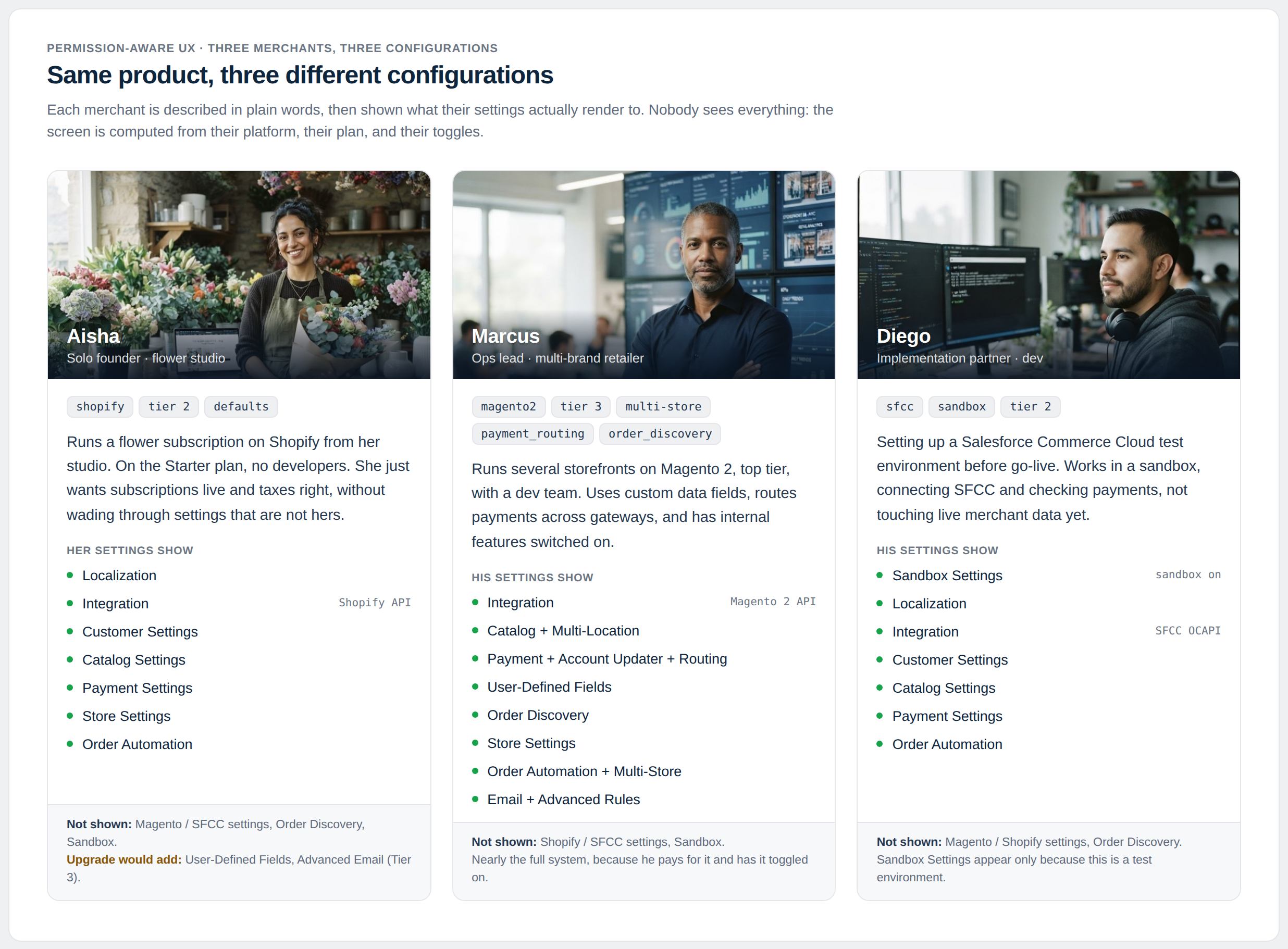
The relevance problem. The same product also had to be a different interface for every merchant. The commerce platform, the paid plan, and hand-flipped internal flags all changed what actually applied to a given account. The old app handled this ad hoc, dropping inapplicable sections with no trace, so no one could tell whether a section was missing, broken, or simply not theirs yet.
The rebuild came down to three calls.
1. Group settings by the merchant's job, not the software's module. Keeping the module grouping matched the codebase, but it was the exact reason nobody could self-serve. Instead I re-mapped every setting around what a merchant is trying to do. The product lead's own test for whether it worked: you go to settings, then customer, and you think "it's probably there."
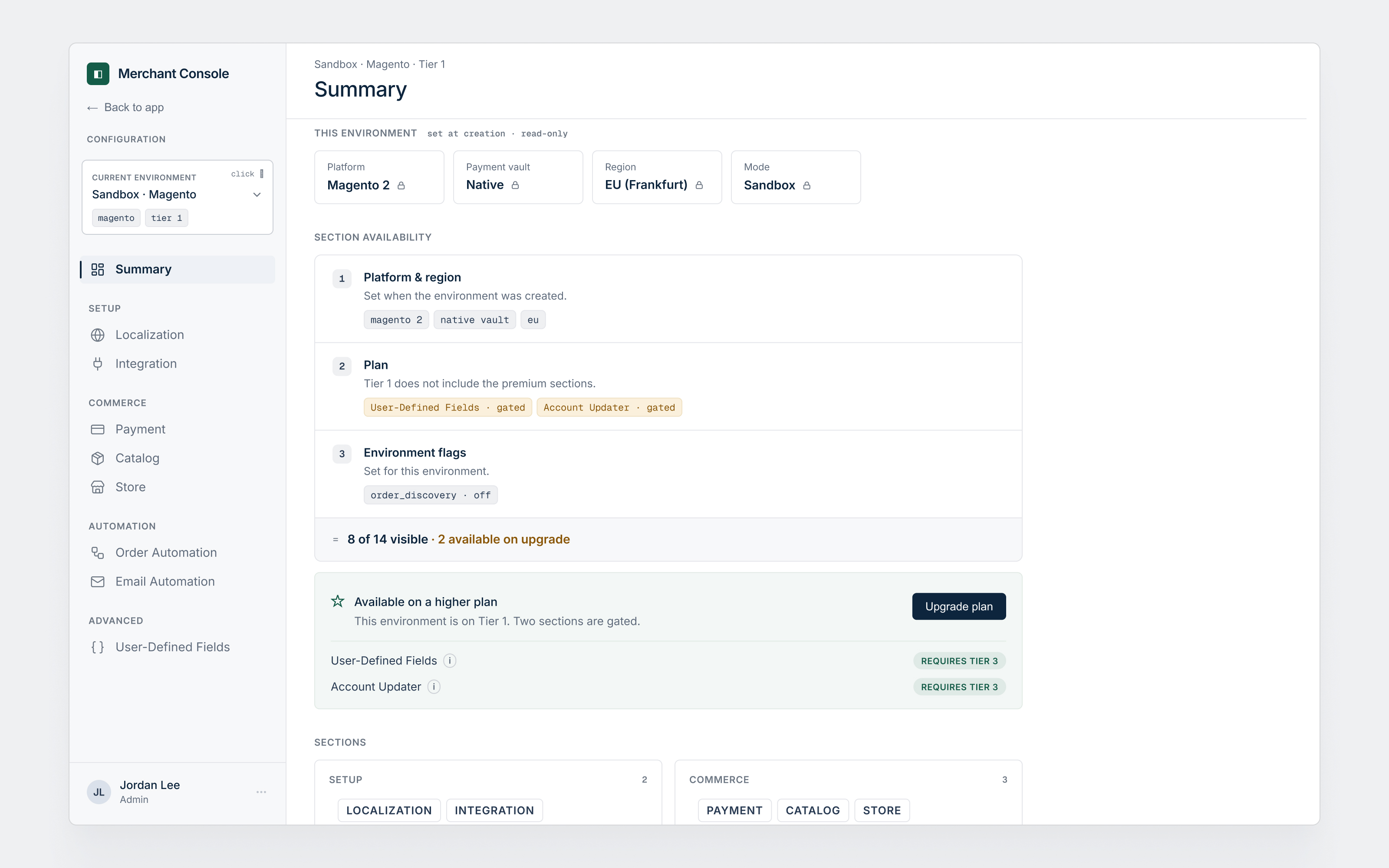
2. Compute visibility from three layers, don't fork the product. Forking a separate configuration per platform or plan would multiply into something no one could maintain, and it was already how the old app coped, hiding things case by case. Showing everything and disabling what didn't apply would bury a merchant under a thousand irrelevant rows. So visibility became a first-class rule, computed from three layers: locked at setup, paid by plan, toggled by hand. The set of sections you see is the product of those three, one interface, no forks.
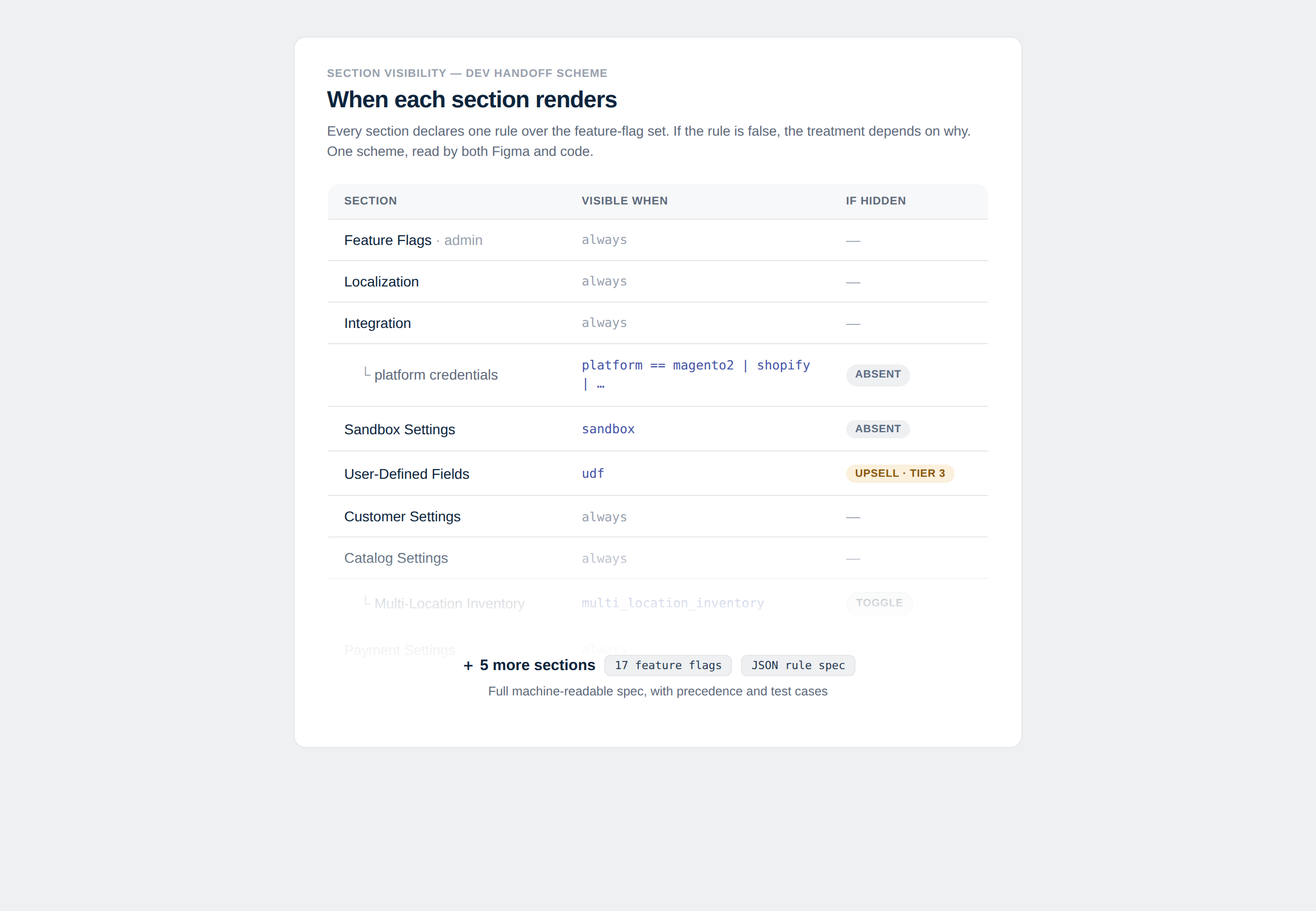
3. Explain the gate, don't hide it silently. Hiding silently teaches nothing; showing every locked thing turns the screen into noise. So I hid what was irrelevant and put a reason on what was gated: a capability you haven't bought says so, and points to the plan that includes it. A blank space leaves a merchant guessing. A gate with a reason tells them exactly where they stand.
Global search. This was my first instinct to propose as a feature. We figured out fast that it was a plaster on an open wound: a search box makes a broken structure searchable without making it work. So we cut it, fixed the taxonomy first, and left search as a convenience for later rather than a crutch for now.
A separate build per platform. The old app effectively forked itself, hiding and showing things case by case until no two accounts behaved alike. Formalizing that into a configuration per platform or plan would have been the path of least resistance and a maintenance sink no one could hold. I ruled it out in favor of one interface with visibility computed from three layers.
Surfacing every setting. A meaningful share of settings still lived only in the database, reachable by engineers. Pulling all of them into the UI would have looked more complete and buried the merchant under rows they would never touch. I scoped the surface to what a merchant actually configures and left the rest where it belonged.
Bespoke polish per screen. Every screen could have been tuned to look its best on its own. That is also how a system stops being a system. I held the screens to the shared patterns even where a one-off would have looked a touch nicer, because a template the team reaches for beats a screen they admire and cannot reproduce. That restraint was the point of the exercise, not a compromise I had to swallow.
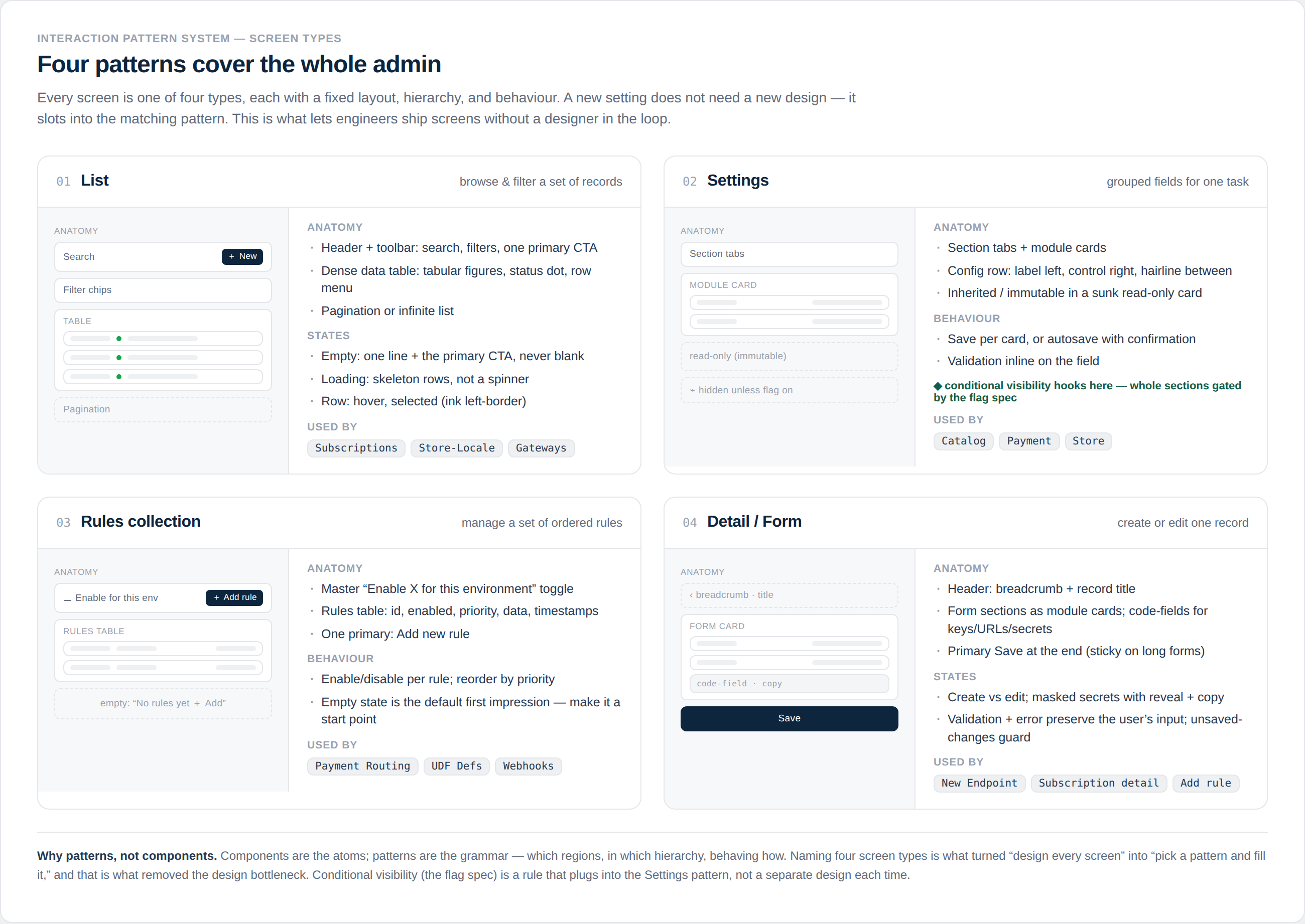
The point of the handoff was reuse. I pulled the whole surface down to the smallest set of repeatable patterns I could get away with, four of them: a list, a settings form, a rules table, a record detail. A new section stopped being a design problem and became an instance of a template. The fewer templates there were, the less the team had to come back to me, so I optimized hard for it: where a screen could be one more instance of a pattern instead of a prettier one-off, it became the instance. The product lead's two-level navigation with tabs inside each section fell straight out of that, repeatable by construction, and the design system was written to be built from rather than just looked at.
The structure outlasts the engagement, which was the point.