Health tech (anonymised) · Data visualisation · AI trust patterns · Self-directed concept
Published September 24th, 2026 · 7 min read
A cardiologist turns the screen toward a patient who had a heart attack a few months ago. Years ago I designed the dashboard for that moment, as client work for a health-tech company. Looking at it now, it answered the doctor's question and skipped the patient's: the loudest thing on it was "31% less risk", and nothing said what that means for the person on the other side of the desk.
I reopened it as a self-directed concept with a question the original never had to face: what changes when an AI can explain the chart out loud? I kept what still held up, rebuilt what didn't, and went through the health apps people now carry in their pockets to see which patterns belong in a clinic and which don't. One rule held it together: the risk model calculates, the AI only explains, and the doctor decides.
A set of scenes and a working code prototype on illustrative data: risk as a count of 100 people, a goal that belongs to the patient, a plan drawn without a date it can't keep, and AI answers the doctor reviews first. It shows where AI earns its place in this conversation and where it has to stay out. Nobody has tested it with patients yet.
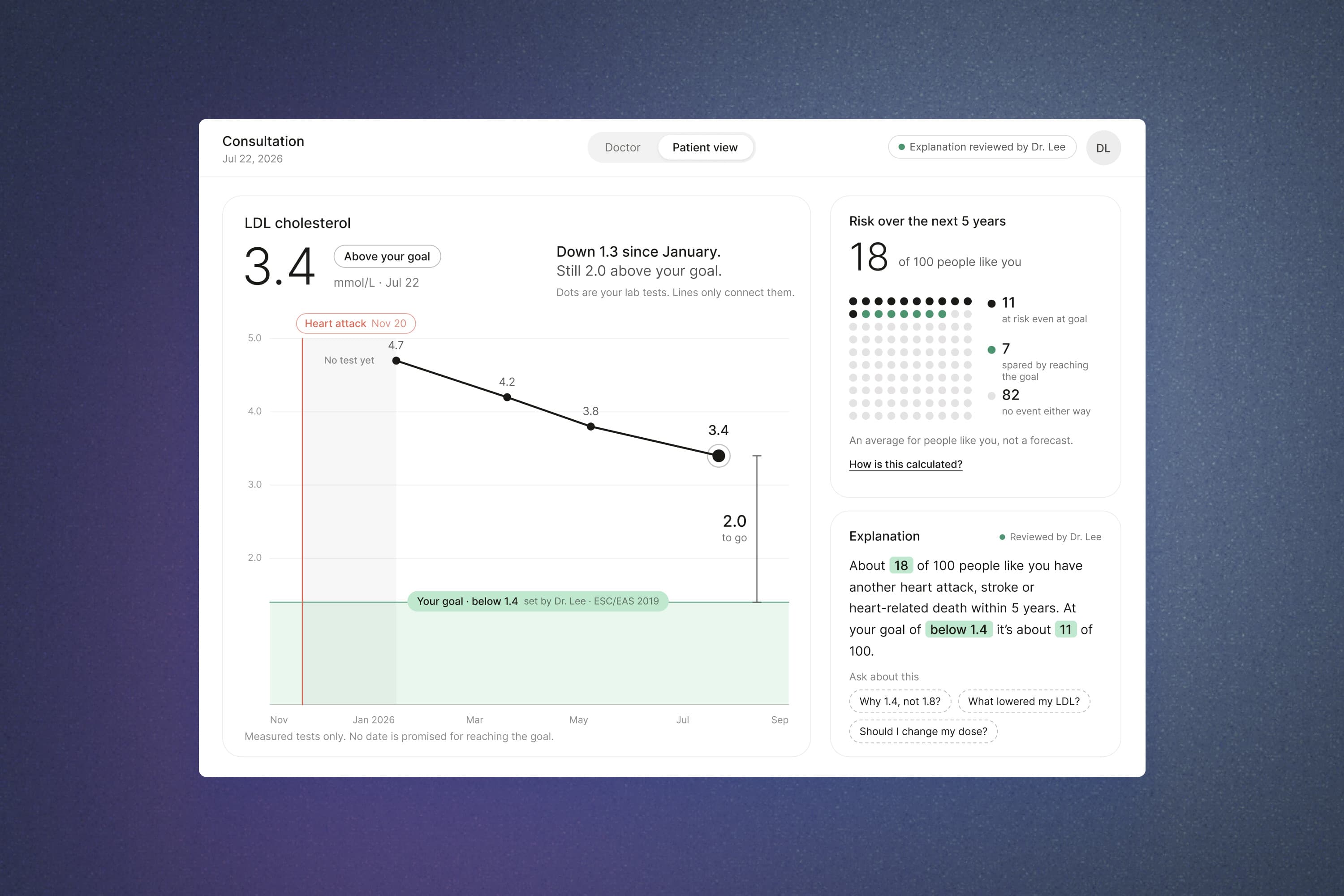
Reimagined from my earlier client work. Company, sponsor and patient are anonymised. Every number comes from an illustrative model calibrated to the original screens, not from clinical data.
The original was client work. I redesigned the doctor-facing dashboard for tablet and mobile, from wireframes to a hi-fi interactive prototype for developer handoff, together with the client's product team.
The rethink is mine alone. I audited the old screens, reviewed current health apps, wrote the brief, built the illustrative risk model every number comes from, designed the scenes, wrote the AI answers and built the prototype in code. Out of scope: the clinical model itself, medical validation, and testing with real doctors and patients.
Some of the old decisions aged well. The risk was already read out as a natural frequency, "about 1 in 6 patients", which is how risk researchers say it should be told. The sliders for previous, current and target LDL already worked as a what-if: the patient moved a value and watched the risk move. And previous LDL was drawn as progress, so the patient could see what they had already achieved.
Other things didn't survive a second look. The y-axis ran from 0 to 100% while the curves lived between 0 and 40%, so the gap between "now" and "at target", the one thing the patient needed to see, looked like a rounding error. The biggest type on the screen was the relative reduction, and a patient who hears "31%" a few months after a heart attack hears a promise. The mobile version showed risk on circular gauges, and the numbers in the mockups didn't even agree with each other. Most of all, the screen was built for one reader: the doctor moved the sliders, and a red "current" line did the talking.
The original never had to decide what an AI may say. Now that question comes first. If a language model can write a number, then no number on the screen can be trusted, including the ones that came from the model. And if it answers every question, sooner or later it will answer one about medication.
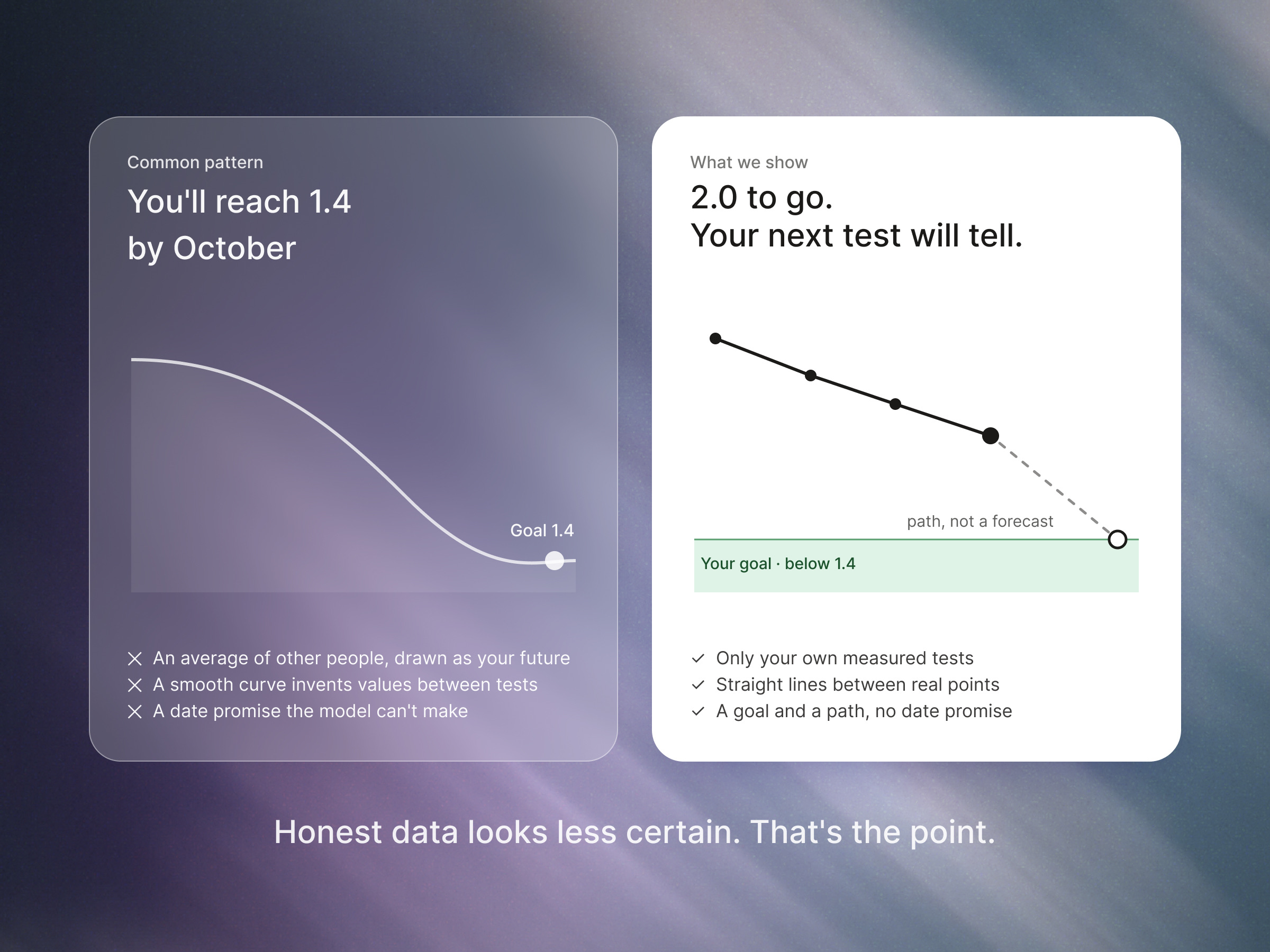
The same trap sits inside the charts, with no AI involved. A smooth curve that glides onto the goal "by October" looks kind, and it is a forecast nobody made: the model knows the risk at a given LDL, not the date a patient will get there.
Before redrawing anything I went through the apps that set patients' expectations today: wearables, lab-test apps, weight-loss programmes. Some patterns came straight in. Wearables label the value at each point and highlight the latest one, compare you with your own baseline as a dashed line, and put one plain sentence above the chart. Oura's "ask about this" chips under a chart became the patient's questions. A lab-test app's "What we found" story shaped the doctor's prep mode.
More was left out, and the reasons are the useful part:
None of these are bad patterns. They were built for a different job: keeping a healthy person engaged, not helping a frightened one understand.
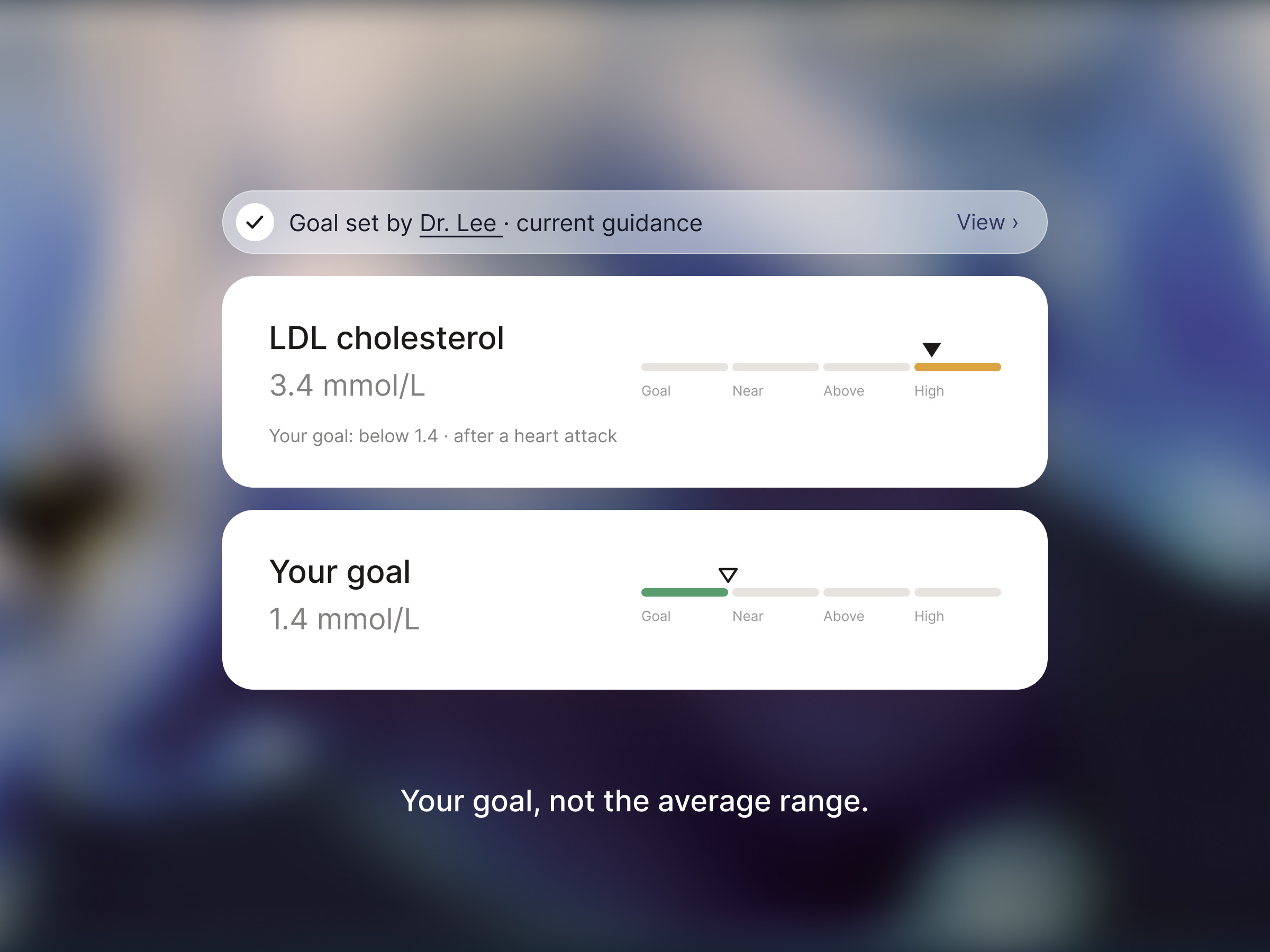
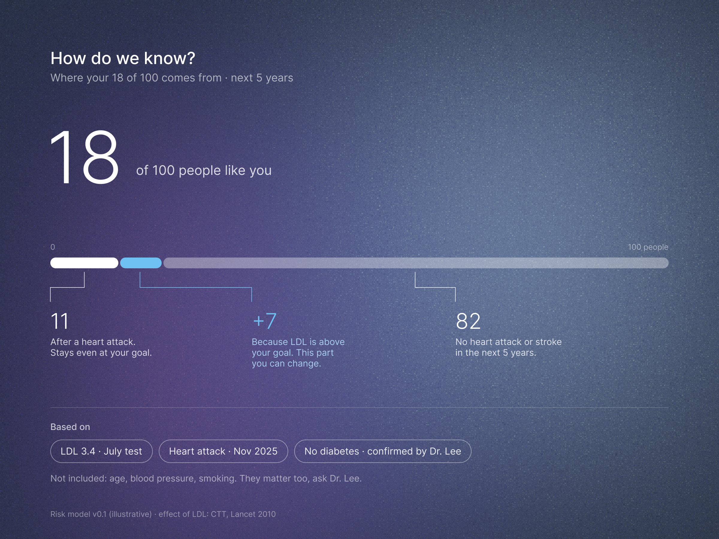
1. Show risk as a count of people. I could keep the relative number, switch to an absolute percentage, or count people. I chose the count: 18 of 100 people like you have another heart attack, stroke or heart-related death within five years. Then I split it, because the split is the conversation: 11 of them stay at risk even at the goal, 7 are spared by reaching it, and 82 have no event either way. Every count carries the same line: an average for people like you, not a forecast.
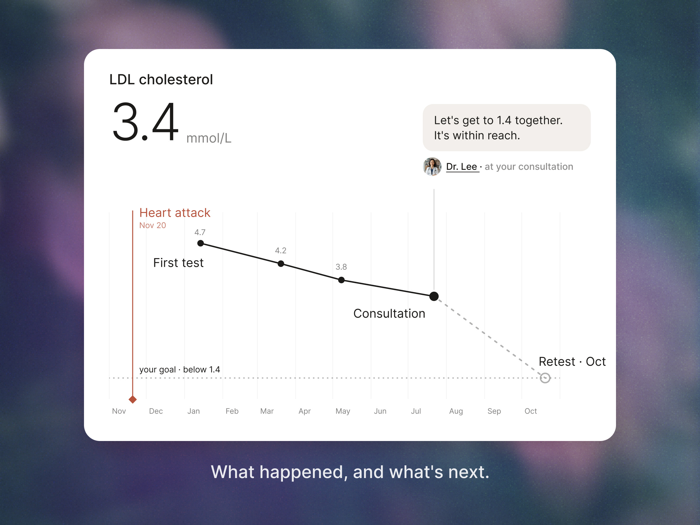
2. Show the plan without a date. The options were the smooth predicted curve, no future at all, or the measured tests plus a plan that admits it is a plan. I chose the third. Measured tests are solid dots joined by straight lines, because nobody measured anything in between. The plan is a dashed line to the goal with no date on it. Time runs to scale, the heart attack is an event line with a date, not a value, and the goal zone is the patient's own, set by the doctor with its source one tap away.
3. Let AI write the words, not the numbers. I weighed three set-ups: let the AI explain freely, allow only fixed templates, or let the AI write the words while every number stays bound to the model. Free text was fast and unsafe, templates were safe and read like a leaflet, so I chose the third. Numbers inside an explanation are live values from the model, highlighted so the patient can see which parts are the math. The doctor reads the draft first and can rewrite any word but not a number. When the patient asks "Should I take a higher dose?", the AI doesn't answer: the question moves onto the doctor's list for the end of the visit.
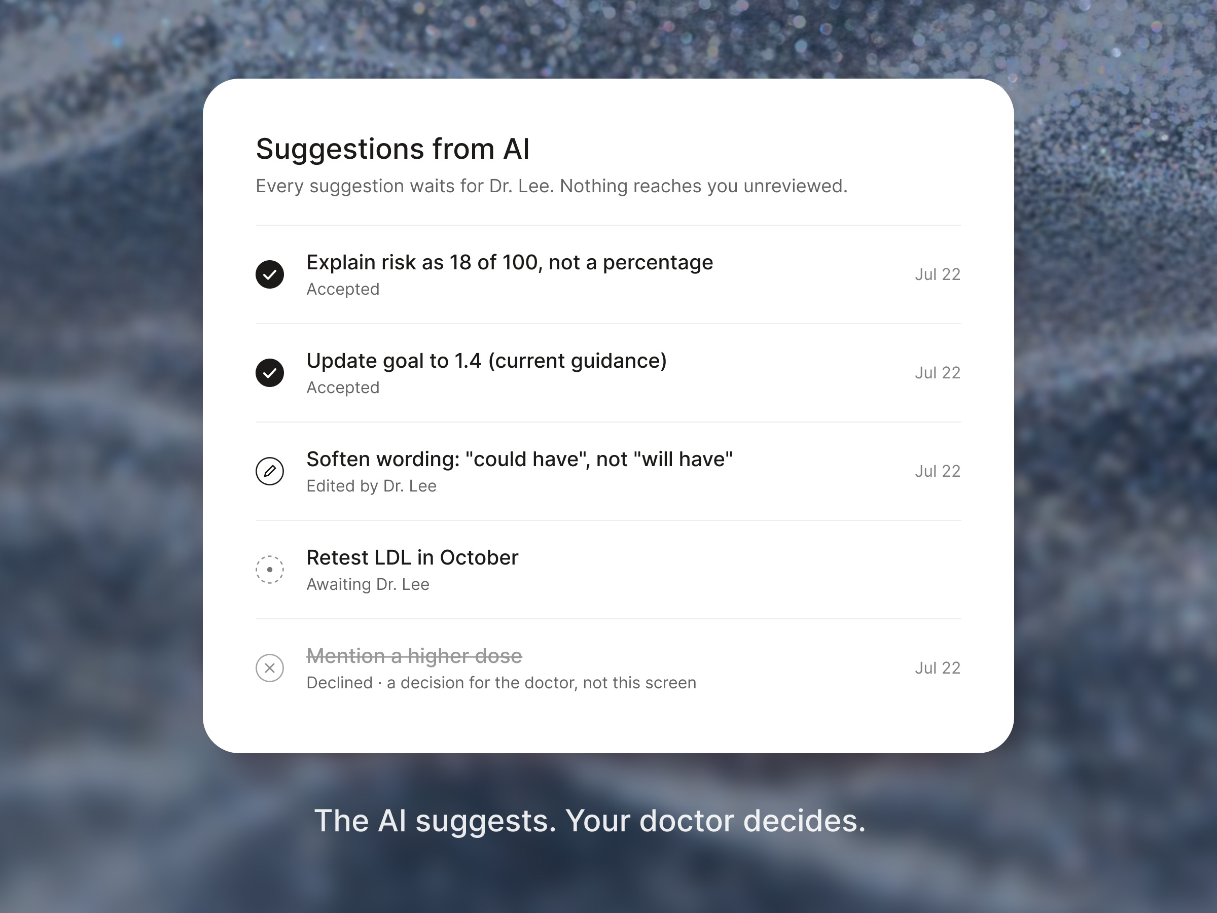
An audit of the original screens, a review of current health apps with what to take and what to leave, and a brief. A set of scripted AI scenarios, one per trust pattern, with a question bank and a states matrix: missing data, a value outside the model's range, AI offline, explanation not yet reviewed. A prototype in code with a prep mode for the doctor and a shared consultation mode. And the scenes on this page, from the LDL journey to the doctor's history of AI suggestions.
The moment I'd point to first happens in prep mode. The provenance check noticed that the original target of 1.8 came from older guidance, and that current guidance for this patient says below 1.4. There the source isn't a footnote, it's the reason for a button: the doctor updates the goal, and every number on the shared screen follows.
What works:
What doesn't work, or isn't proven yet:
The dashboard I designed back then was correct. It just wasn't legible to half the people looking at it, and an AI that talks fluently would only have made that gap sound confident. So here is the question I'd ask of any product putting AI next to its numbers: when your screen turns toward the person it's about, does it still tell the truth?
Data that is correct but not readable? That's the wall I look for first.

