

Agentproof: Turning a home-made design system into one AI agents get right
I built a design system for myself, and it worked because I knew where everything was. Then the client's team used it with AI and got a table that failed contrast. So I had AI agents build real screens from it and fixed the system wherever they drifted.
Published October 21st, 2026 · 8 min read
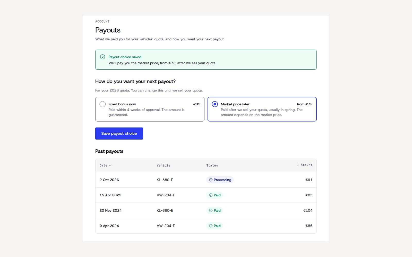
The screens in this note come from a reference implementation of the system. The brand has been modernised and renamed ("Voltwise" is fictional), and no client screens are shown.
I built this design system the old way, and for myself. Nobody briefed it, and nobody paid for it. I needed it to work faster on a client's product, so it grew the way a home kitchen grows: far from ideal, but I could close my eyes and reach for the salt.
Then other people started cooking in it. The client's team and their developer began building from my components, and lately they had been doing it with AI.
One fine afternoon I opened Figma and saw what someone on the client's team had built from my components with AI. It was awful, really awful. The text in the table barely stood out from its background, the labels sat where they made no sense, and the border was so light it nearly disappeared. Every colour in it came from my design system, and that was the part that stung, because it meant the fault was mine. My system had no hard rules for a table, so the AI simply took whatever looked roughly right. The client didn't even notice. It could easily have gone to production if I hadn't raised the alarm. The team promised it would never ship like that, but I wouldn't bet the farm on it.
After the first shock, I realised my system wasn't agentproof. It had text styles for tables, but no Table component. The salt and the flour were on the shelves; there was no recipe. A stranger, human or AI, could see my system but couldn't build from it, or tell when the result was wrong.
A number I couldn't read
So I had an automated audit run on the system. It gave 67 out of 100, with good marks for names and consistency and not a single component described. A week later, after I had rewired how every colour in the file was connected, it gave five more points, and when I deleted a variable nobody used, part of the score went down.
I'll be honest: scores like these don't speak to me. I couldn't tell you whether five points is a lot. What I can read is a screen. And I already knew how to make components that look right and pass accessibility checks. The hard part was the layer no eye sees: the rules agents read before they build. So I stopped asking the system for a number and started asking agents to build from it.
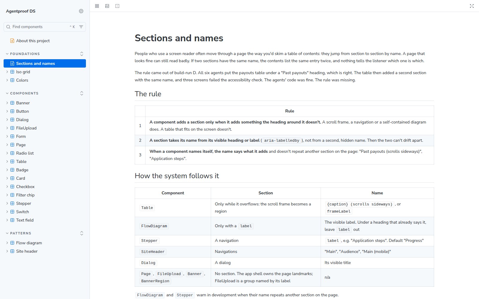
I gave agents the Figma file and tasks phrased the way a product manager would ask, never naming the component. Each version of the system got three runs, and a separate agent judged the results without knowing which version it was looking at. My first try went wrong in public. I published a post called "I failed my own test", and my first agent test said 0 out of 5. Then I saw I had graded "there is no token for this" as the agent's mistake. With a fair rubric, the same file scored 3 out of 5, and I said that in public too.
The missing word
The clearest answer came from a failed upload. The original file had no word for "error", only one for "warning". Asked how to tell someone their upload failed, all three agents chose a warning, which is exactly what the live product does today. The agents were careful; they copied the only meaning the system had.
So I rewired the colours by meaning. The file had held three token systems at once: its own, a client library's and an old UI template's. Matching them by name would have been quick and wrong: the client library's "secondary" text was our "tertiary", and 443 texts would have turned darker. I split one red into two meanings instead: danger for an action you can't undo, error for feedback that something went wrong. On the way I found five contrast failures inside the system itself, including the hover on its own buttons.
--color-background-danger-solid: var(--color-red-600); /* an action you can't undo */
--color-background-error-solid:  var(--color-red-600); /* feedback: something went wrong */
Same base red. The name says which job it does.
Judged blind, the agents' colour choices went from 0.63 to 0.83, and to 0.97 once the guide was added. Any tool can rename a token; deciding that one red carries two meanings was the design work.
Six agents, eighteen screens
The Figma tests measured plans. To see what agents actually build, I made a reference implementation of the system in React and Storybook together with Claude Code, and gave six fresh agents the same three screens: remove a vehicle, retry a failed upload, review past payouts.
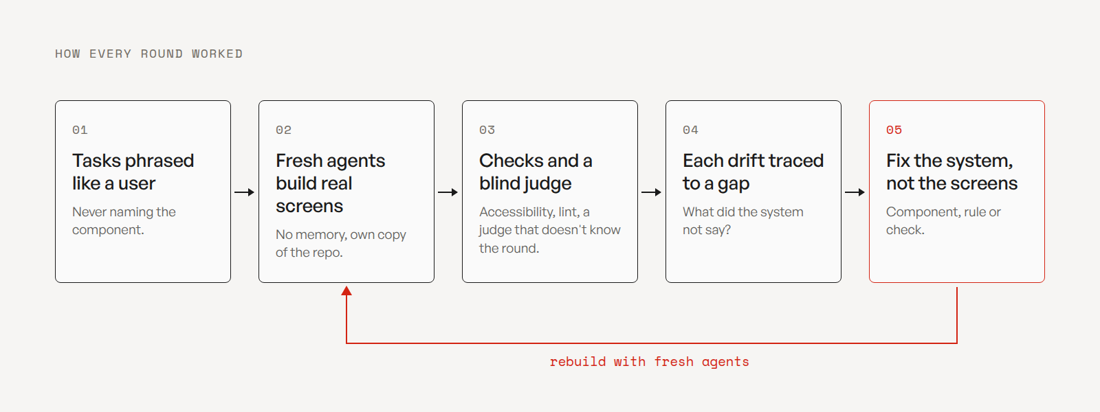
I had read plenty about agents that lie and make things up. Mine were careful. Where the system spoke, they followed it: 18 screens, no invented components, no raw colours, and the failed upload shown as an error by all six.
Where it was silent, each agent decided for itself. Nothing said how wide a page should be, so the screens came back in six widths, from 640 to 880 pixels. There was no upload control, so all six built their own. Five of six didn't announce an error after an empty submit.
And one problem was simply mine. All six put the payouts table under a "Past payouts" heading, which is right. My Table then added a second section with the same name, so a screen-reader user moving through the page by its sections heard "Past payouts, Past payouts". Three screens failed the accessibility check.
Fixing the kitchen, not the cooks
I could patch the agents' code, give them more instructions, or change what the system offers. I tried instructions first. Half of the agents got a written recipe for confirming a delete, and it changed one phrase in a dialog title; everything else was already in the component docs. Agents follow what the system shows them more than what a prompt tells them, so the fixes went into the system.
The checker found two sections with one name; deciding that the Table was at fault, and not six agents, was mine. One rule for section names now covers every component that builds a section, and the three failing screens passed with their own code untouched. Then came a page component with two named widths, an upload control, errors that are always announced, and a short file agents read before they build, with a check that flags a hand-picked value before it ships.
## Meanings are reserved
`error` = it failed or blocks the task. `warning` = it will cause a problem later.
`danger` / `tone="destructive"` = an action that can't be undone. Never swap them for the look.
From AGENTS.md, the file agents read before they build: the meaning is a rule, not a colour.
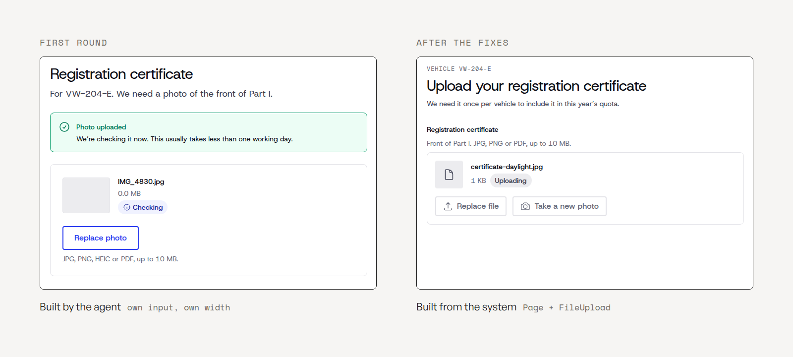
Before: a first-round agent's own upload screen (excerpt).
<div className="mx-auto flex w-full max-w-[640px] flex-col gap-6">
  <h1 className="m-0 type-desktop-header-small-default text-primary">Registration certificate</h1>
  …
  <input ref={inputRef} type="file" accept={ACCEPT} className="hidden" onChange={onFile} />
After: a fresh agent on the fixed system.
<Page width="narrow" title="Upload your registration certificate" …>
  <FileUpload label="Registration certificate" capture status={status} error={TOO_DARK} … />
</Page>
About 120 lines became under 50: the width, the title and the upload now come from the system.
All of it lives in a public Storybook at ds.valerianyman.com: 102 stories, each with interaction tests and an accessibility check, rebuilt on every change.
The second round
Three fresh agents built the same three screens on the fixed system, with no recipe and no longer prompt. They also met the standards no eye sees: errors reached screen-reader users, and every screen passed the accessibility checks.
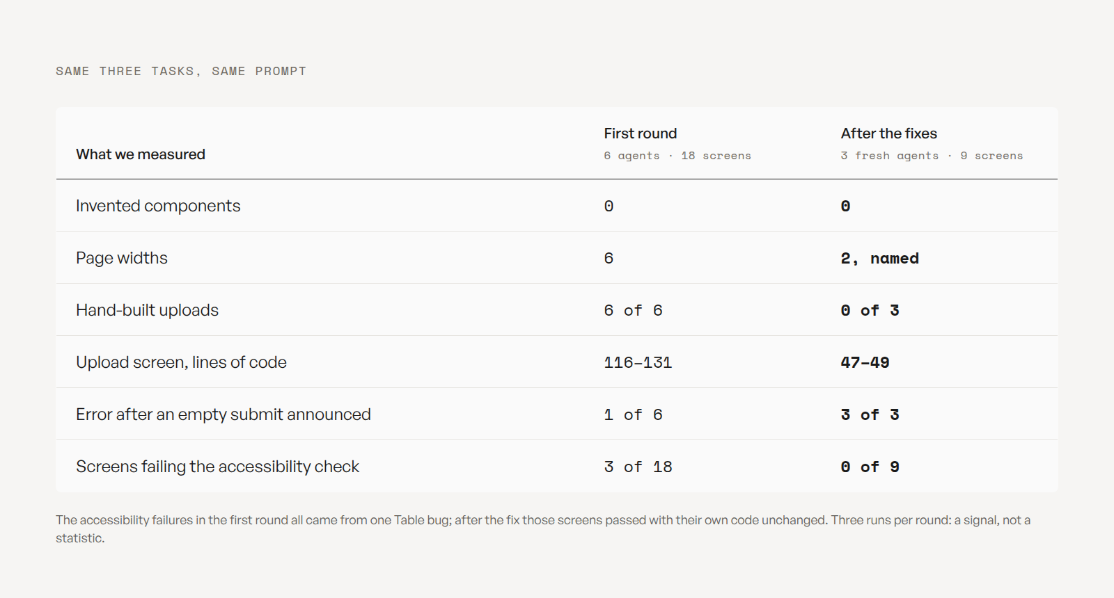
- Page widths went from six to two named ones. (Measured, 3 runs)
- Hand-built uploads went from six out of six to none. (Measured)
- The upload screen shrank from about 120 lines of code to under 50. (Measured)
- The error after an empty submit was announced on every screen, where before only one in six got it right. (Measured)
Limits. Three runs per version, one model, one system. I wrote both the system and the scoring, and the prompt told agents to mark what was missing instead of inventing it. The judge is an AI and was close to its ceiling, so the mechanical numbers carry the claims. There is no production data from the client's team, and the client hasn't reviewed this note.
The agents also wrote down what the system still doesn't have. All three named the same gaps: a list of records, an empty state and a section heading. That is the next backlog, written by the builders themselves.